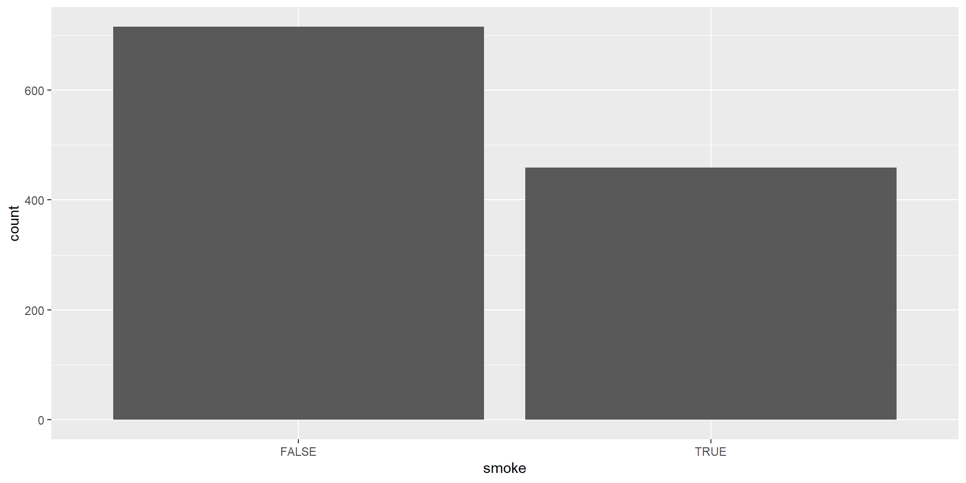
| Smoking_Status | Frequency |
|---|---|
| FALSE | 742 |
| TRUE | 484 |
| Total | 1226 |
Chapter 2: Description of Samples and Populations
Week 2 Lecture 1
Let’s Refresh Our Memory
Until now, we have:
- identified the differences between anecdotal and empirical evidence
- discussed the differences between observational and experimental studies
- defined the terms population and sample
- examined different types of random sampling
And OF COURSE
- We took our first steps in RStudio!
What about Today?
Today we will:
- have an introduction to descriptive statistics
- see examples of frequency distributions enabling us to summarize a categorical variable or a quantitative variable
- either as a table or a graph
- see examples of frequency distributions enabling us to summarize a categorical variable or a quantitative variable
- see how to identify/calculate shape, center, and (maybe tomorrow) dispersion in a data set.
Making Sense of Data
Data sets can be messy and overwhelming at first glance. By using descriptive statistics, we can:
- Visualize to reveal patterns,
- Summarize key information, and
- Organize data for better understanding
When discussing a set of data, we want to describe the shape, center, and dispersion of the distribution.
Data Visualization
Introduction
They are graphical representations of data
We use different colors, shapes, and the coordinate system to summarize data
They can tell a story or help explore data
A Successful Data Visualization…
According to Royal Statistical Society, a successful data visualization will:
- Grab attention
- Improve access to information
- Increase precision
- Bolster credibility
- Summarise content
Examples
Further Resources
Royal Statistical Society - Best Practices for Data Visualisation
-
- We will only touch the surface of data visualization in this course. It is a rich field.
- Let’s dive into descriptive statistics to learn more about the basics.
But Before… Notations and Vocabulary
Notations
- We use symbols to differentiate between a variable and an observed value of that variable.
- \(Y = mass\) (Variable)
- \(y = 12.8\) lb (Observed Value)
Vocabulary Time!
Parameter: A number represents the entire population (e.g., population mean).
Statistic: A number calculated from a sample (e.g., sample mean).
Descriptive Statistics: Statistics used for describing and summarizing data.
Inferential Statistics: Statistics used to make predictions and draw conclusions. (We will get to this on Wednesday)
Frequency Distributions
Introduction
- A frequency distribution is a representation of the frequency, indicating how often each value appears in a data set.
- This information can be conveyed through tables or, more visually, using a graph.
Summarizing A Categorical Variable
A Frequency Distribution Table
In this section, you will see two examples for summarizing a single categorical variable.
Bar Chart
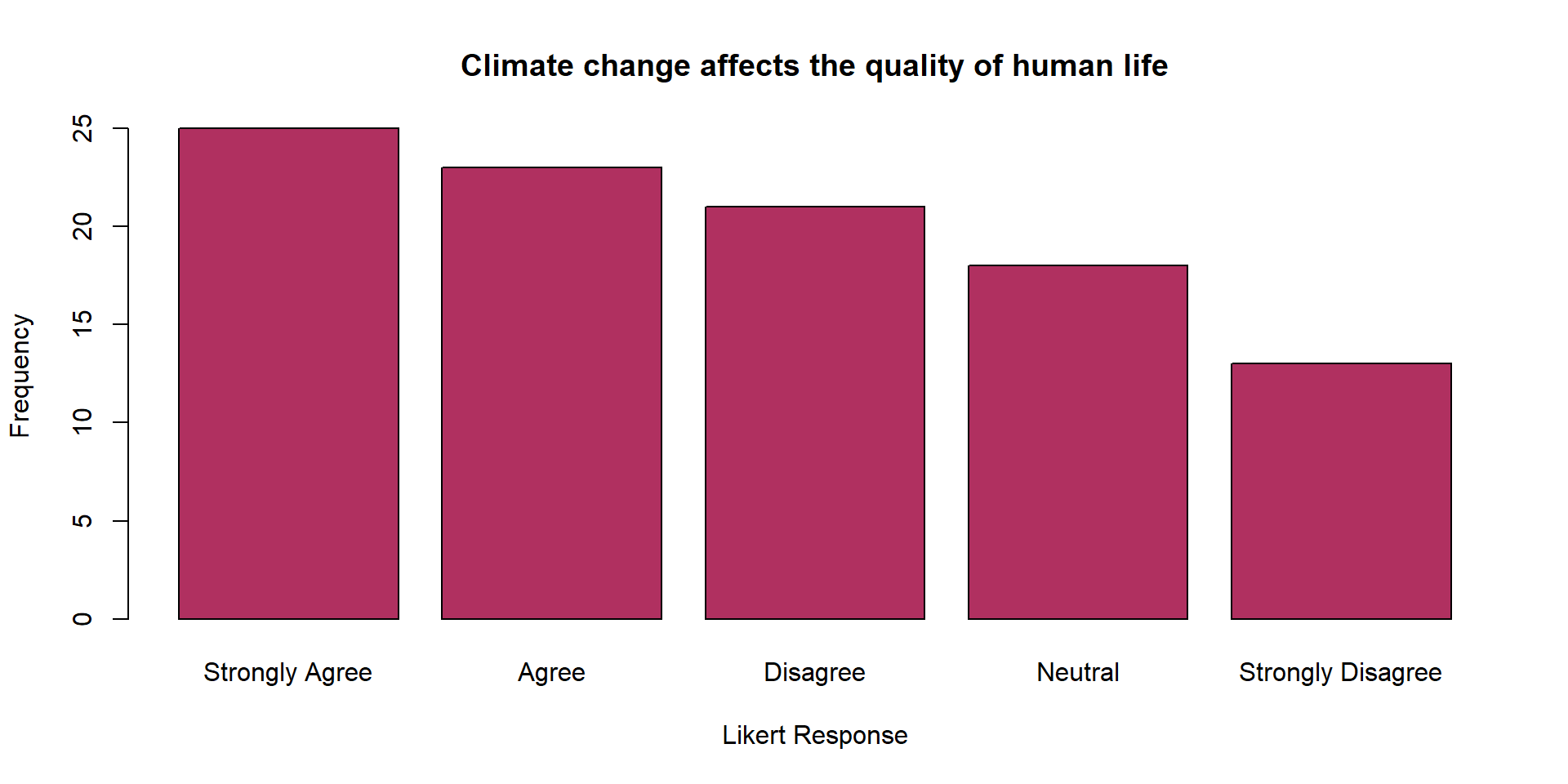
A visual representation of categorical data showing the number of observations in each category.
Another Example
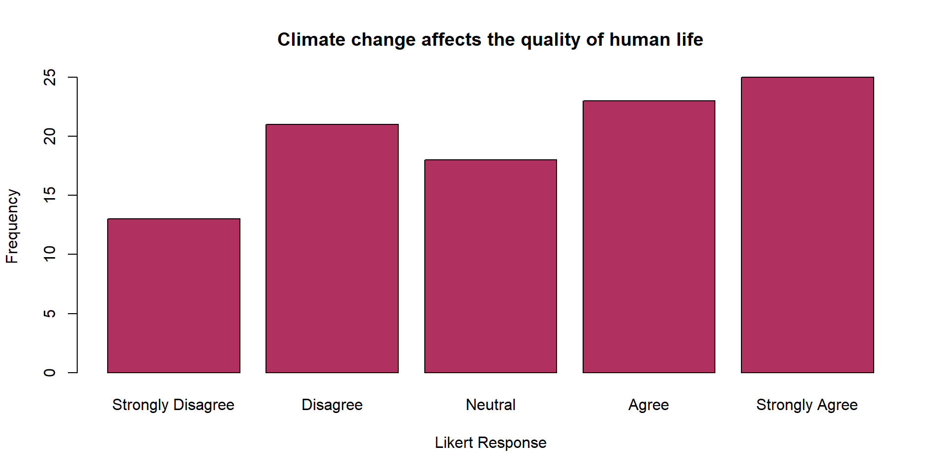
| Likert_Response | Frequency |
|---|---|
| Strongly Disagree | 13 |
| Disagree | 21 |
| Neutral | 18 |
| Agree | 23 |
| Strongly Agree | 25 |
| Total | 100 |
Summarizing A Quantitative Variable
Grouped Frequency Distributions
Histogram
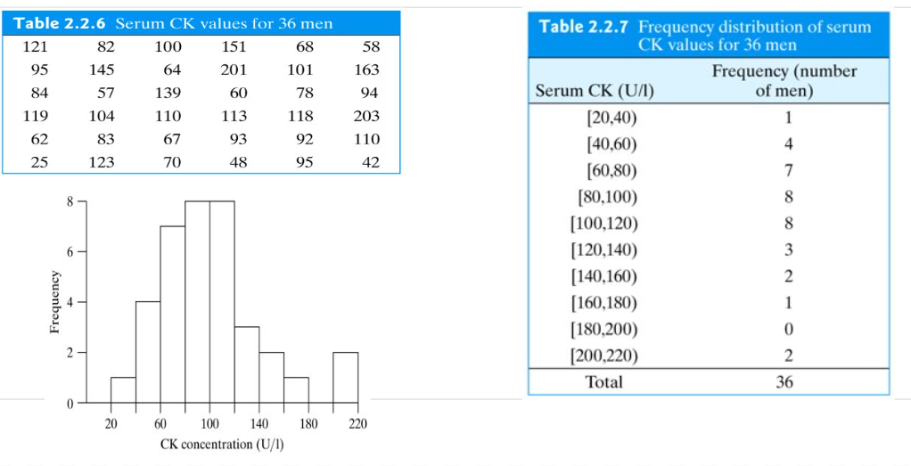
A visual summary of a quantitative variable.
- The x-axis represents the range of values divided into bins,
- The y-axis represents the count of data points in each bin.
- The x-axis represents the range of values divided into bins,
Histograms help identify patterns, outliers, central tendency, and variability.
No Gaps between Bars: Unlike a bar chart, there are no gaps between the bars in a histogram because the bins are continuous.
More on Histogram
Shapes of Distributions
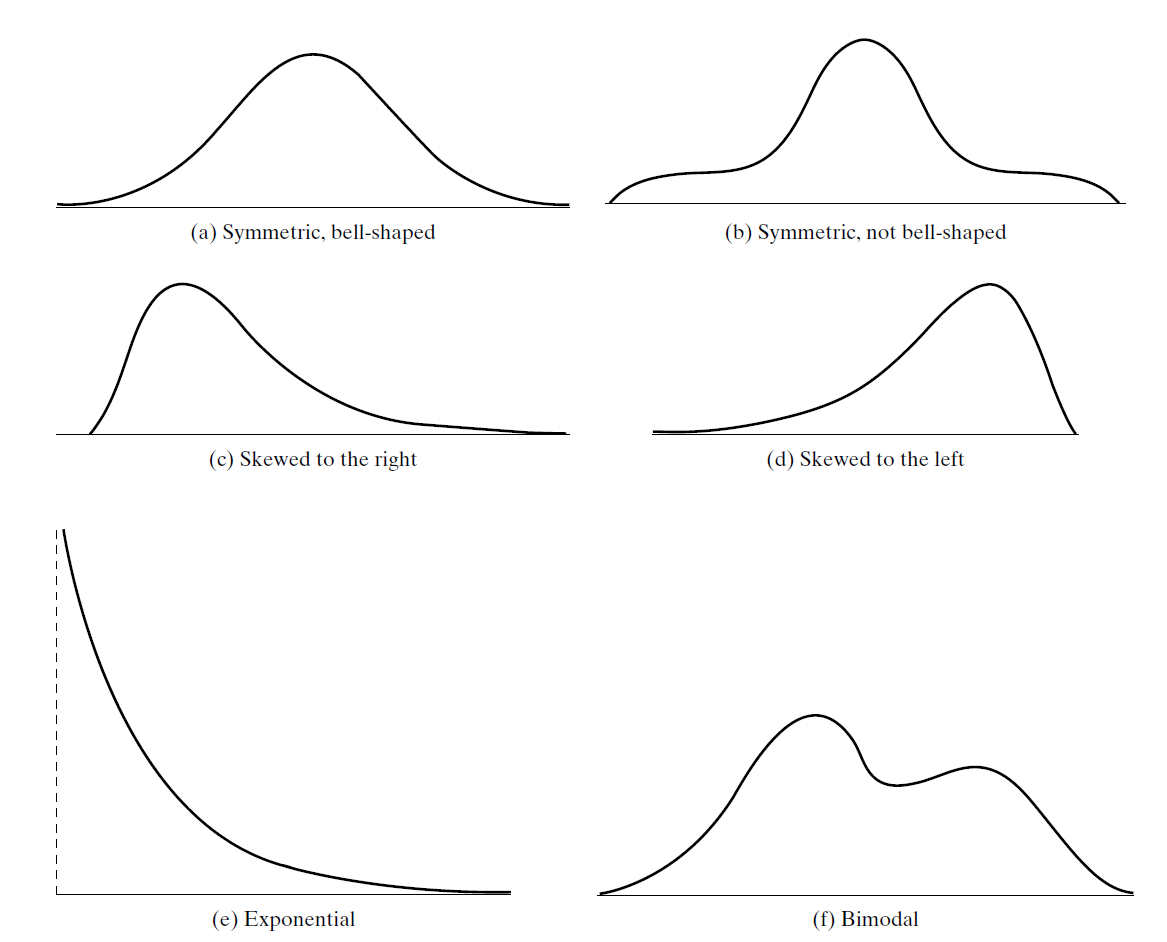
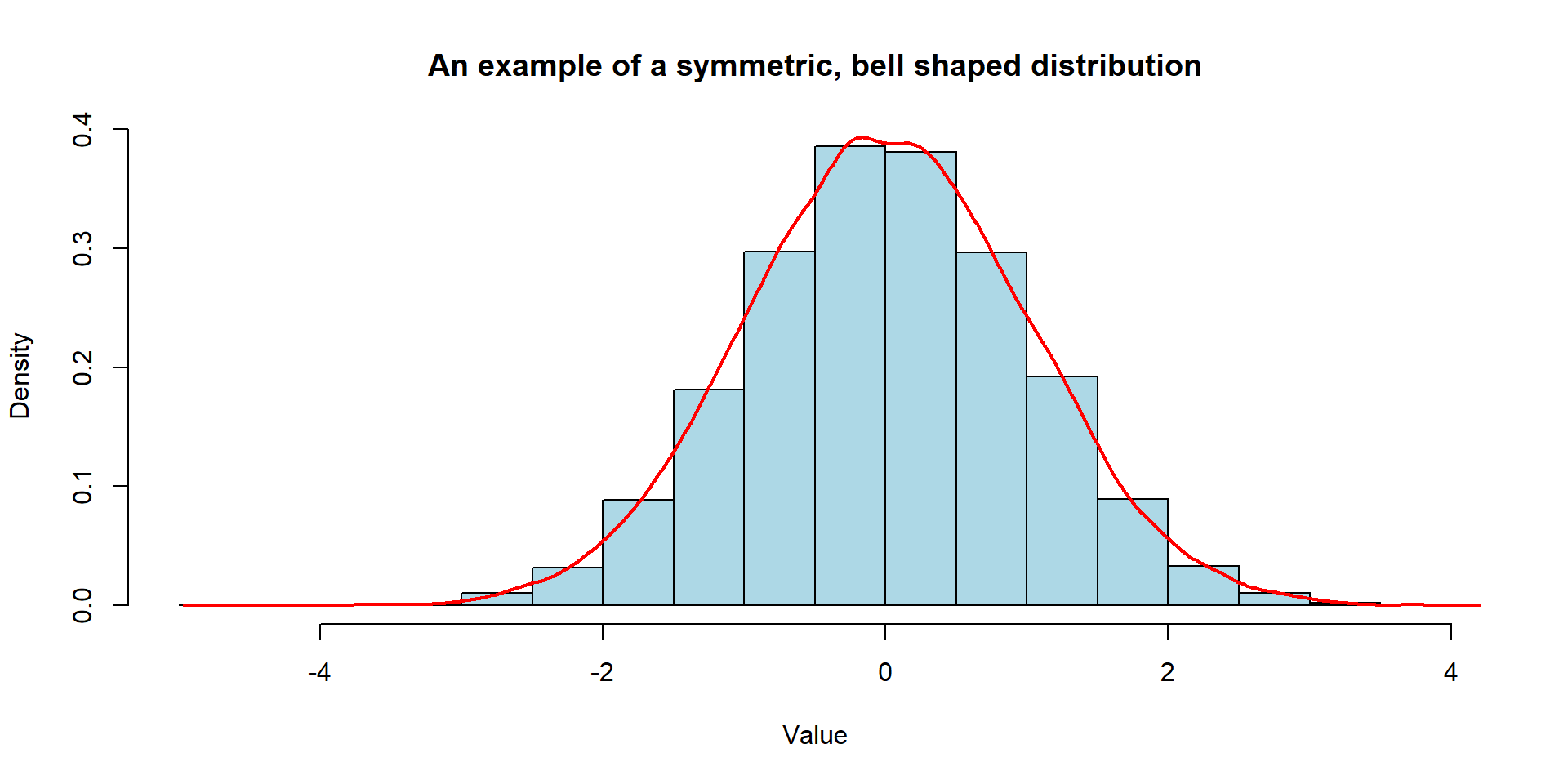
Shapes of Distributions
The shape of a distribution can be represented by a smooth curve approximating of the histogram.
Central Tendency
Measures of Center
To understand the center or typical value of a data set, we calculate
- Mean
- Median
- Mode
We also call these as “Central Tendency”
Mean
- You might be familiar with this term. It is also known as
- arithmetic mean OR sample mean
Tip
Remember we employed a symbolic convention to differentiate between a variable and an observed value of that variable.
- \(Y = birthweight\) (Variable)
- \(y = 12.8\) lb (Observed Value)
We now denote
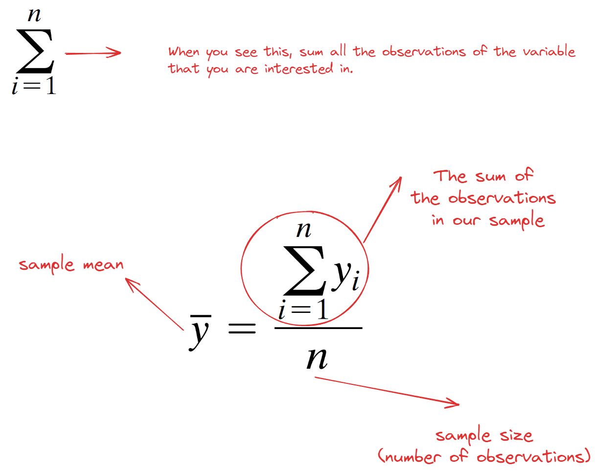
- the observations in a sample by \(y_1\), \(y_2\), . . . , \(y_n\)
- the mean of the sample by the symbol \(\bar{y}\) (read “y-bar”).
Mean
We calculate the mean by using this formula
Median
- Imagine what would happen if Bill Gates was in our class and we calculated the average money in our bank account.
- It might not be the best idea to interpret this average.
- Instead, we can calculate median which is a value that splits the ordered data into two equal parts.
How to Find the Median
- Arrange the observations in increasing order.
- In the array of ordered observations, the median is
- the middle value (if n is odd) or
- midway between the two middle values (if n is even).
- We denote the median of the sample by the symbol \(\tilde{y}\) (read “y-tilde”).
Mode
- The mode in a dataset is the number that occurs with the highest frequency.
- It serves as a measure of central tendency, indicating the most prevalent choice or the characteristic that appears most frequently in your sample.
Let’s have another toy example
- Assume that we have a following dataset:
- 22, 6, 6, 4, 2
| Measures of Center | Data and Calculation | Result |
|---|---|---|
| Mean | (2+4+6+6+22)/5 | 8 |
| Median | 2,4,6,6,22 | 6 |
| Mode | 2,4,6,6,22 | 6 |
Understanding Mean and Median
- Let’s see Rossman & Chance Applet to visualize mean and median.
Spread of Distributions
Let’s assume we managed to collect data from our squirrels on campus :) Our class was divided into three groups, and each group measured the weights (lbs) of 10 squirrels. Here are the results:
Group 1: 1.25, 1.25, 1.25, 1.25, 1.25, 1.25, 1.25, 1.25, 1.25, 1.25
Group 2: 1.0, 1.0, 1.0, 1.0, 1.0, 1.5, 1.5, 1.5, 1.5, 1.5
Group 3: 1.0, 1.4, 1.2, 1.4, 1.1, 1.3, 1.6, 1.0, 1.2, 1.3
Dr. Demirci mentioned that looking at these numbers is so confusing. Can you please calculate the sample mean for them to summarize this data?
All these groups calculated the same mean, which is 1.25 lbs. Dr. Demirci seemed not so happy with this number.
- Why?
