Chapter 2: Description of Samples and Populations & More on Data Visualization
STAT 218 - Week 3, Lecture 4
Warning!
In this lecture, I will again introduce more concepts in data visualization AND the anatomy of ggplot() function.
Please DO NOT CODE with me, just watch the demo to understand the basics.
After that, you will have a chance to try out some of these codes with your group members.
I will use a dataset in my slides but you are going to use another data set in your lab assignment.
Data Visualizations
are graphical representations of data
use different colors, shapes, and the coordinate system to summarize data
can tell a story or can be useful for exploring data
(A quick note: I used some of Dr Dogucu’s materials to this class because I love them!)
Today’s Menu
- Visualizing a Single Categorical Variable
- Visualizing a Single Numeric Variable
- Visualizing One Categorical and One Numeric Variable
- Visualizing Two Numeric Variables
- Visualizing More than Two Variables
Visualizing a Single Categorical Variable
If you…
- If you could speak to R in English, how would you tell R to make this plot for you?
OR
- If you had the data and had to draw this bar plot by hand, what would you do?
Maybe…
- We could tell R something like…
- Consider the data frame
- Count number of mothers in each
smoke - Put
smokeon x-axis. - Put
counton y-axis. - Draw the bars.

These ideas are all correct but some are not necessary in R
- Consider the data frame
Count number of mothers in eachsmoke- Put
smokeon x-axis. Put.counton y-axis- Draw the bars.
R will do some of these steps by default.

Let’s Play with the Babies Data Set
Let’s Play with the Babies Data Set
We need to learn the variables before proceeding.
case: id number
bwt: birth weight, in ounces
gestation: length of gestation, in days
parity: binary indicator for a first pregnancy (0 = first pregnancy)
age: mother’s age in years
height: mother’s height in inches
weight: mother’s weight in pounds
smoke: binary indicator for whether the mother smokes
3 Steps of Making a Basic ggplot()
Pick data
Map data onto aesthetics
Add the geometric layer
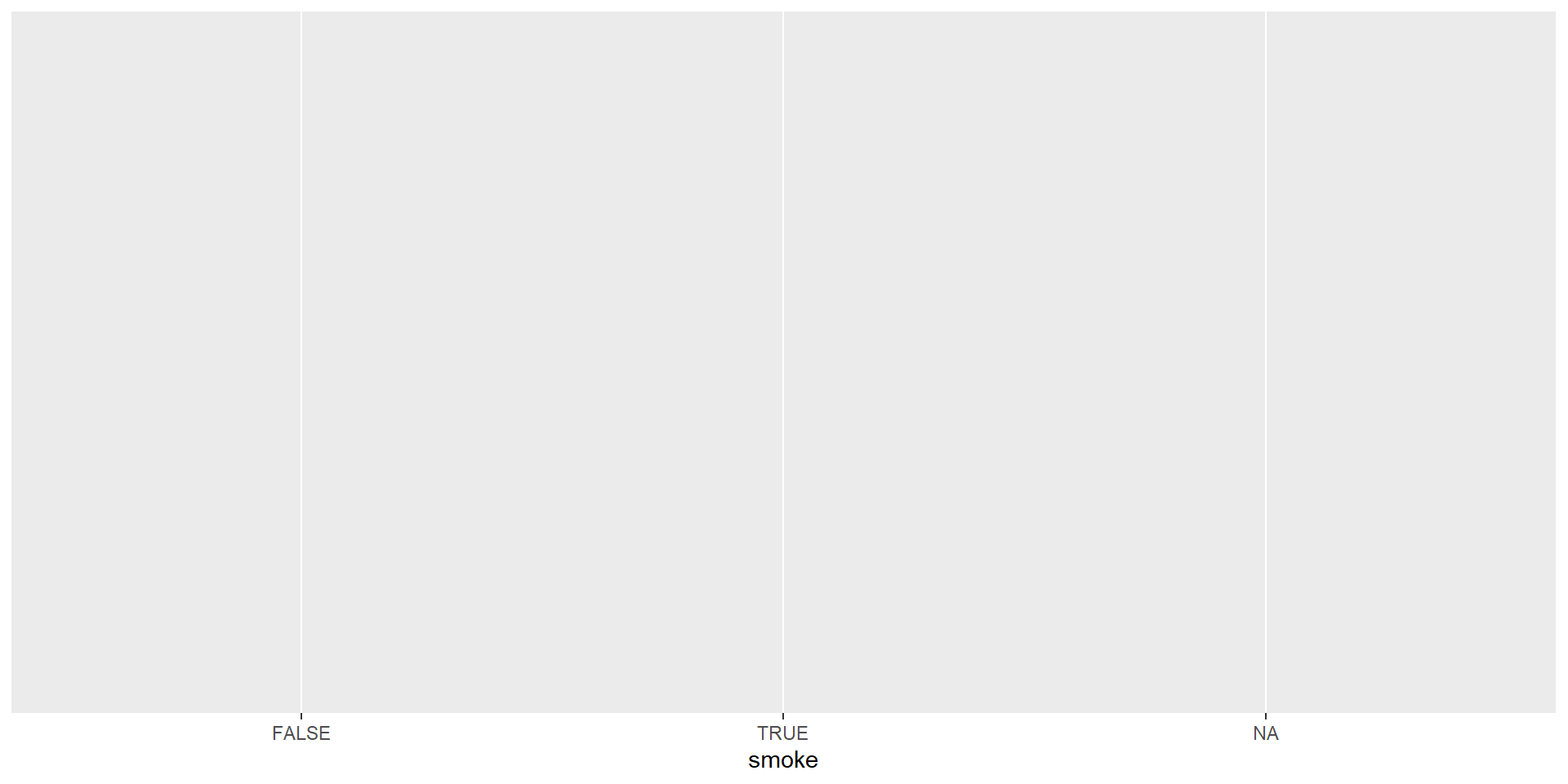
Bar plot - Step 1 - Pick Data
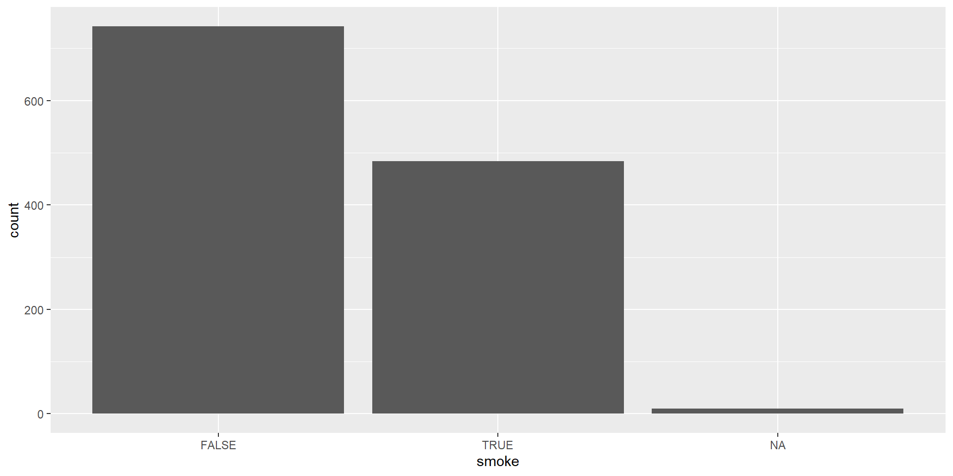
Let’s use smoke variable within babies dataset which is a categorical variable indicating whether the mother smokes or not.
Bar plot - Step 2 - Map Data to Aesthetics
Let’s use smoke variable within babiesdataset which is a categorical variable indicating whether the mother smokes or not.
Bar plot - Step 3 - Add the Geometric Layer
Let’s use smoke variable within babiesdataset which is a categorical variable indicating whether the mother smokes or not.
Visualizing a Single Numeric Variable
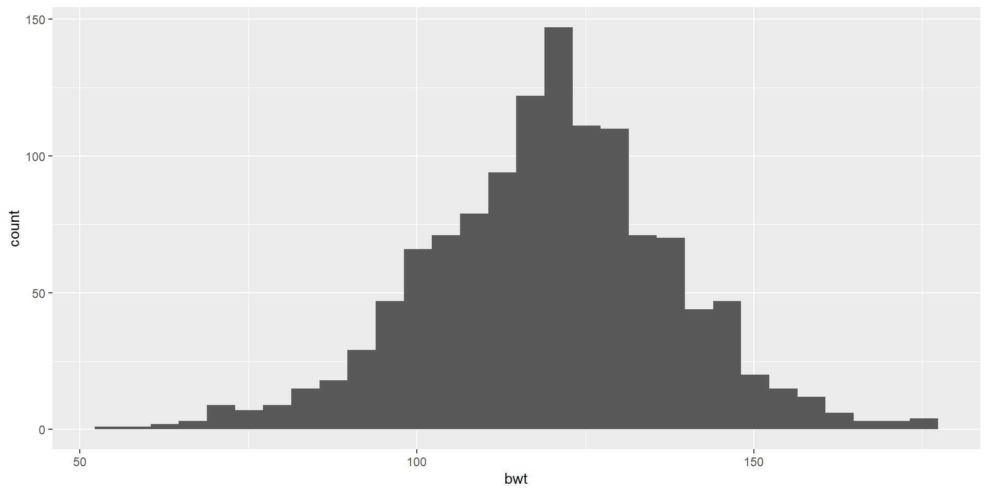
Histogram
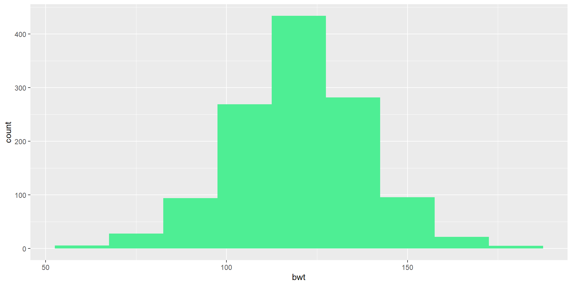
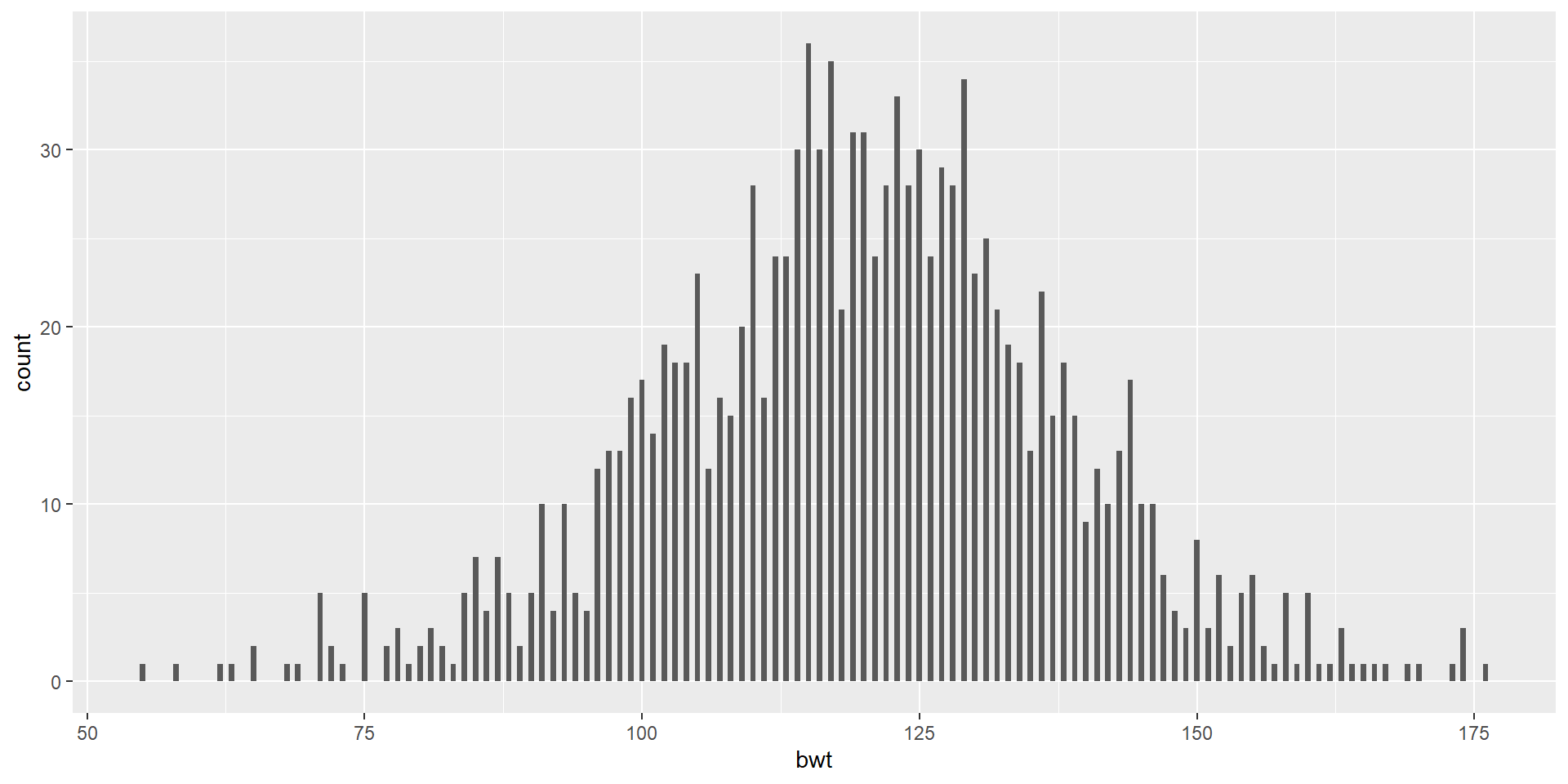
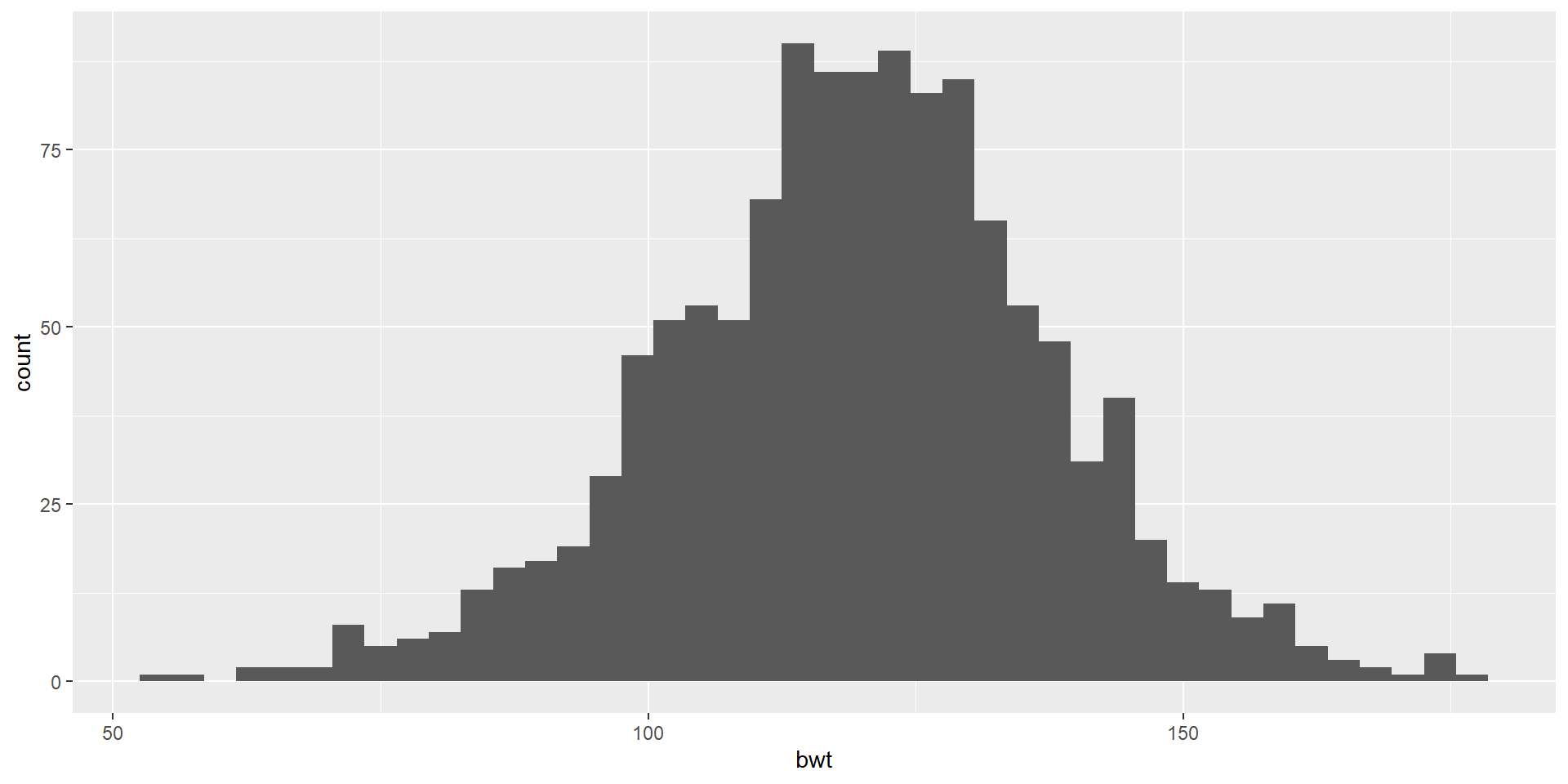
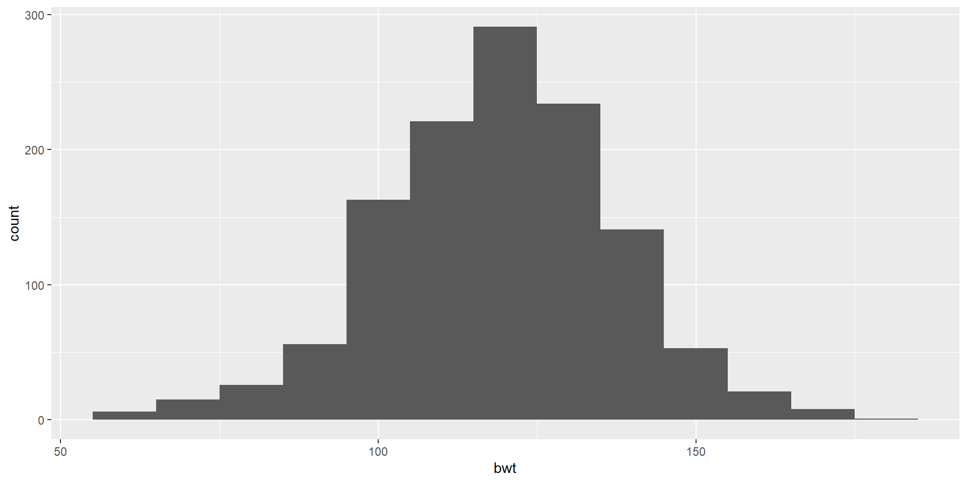
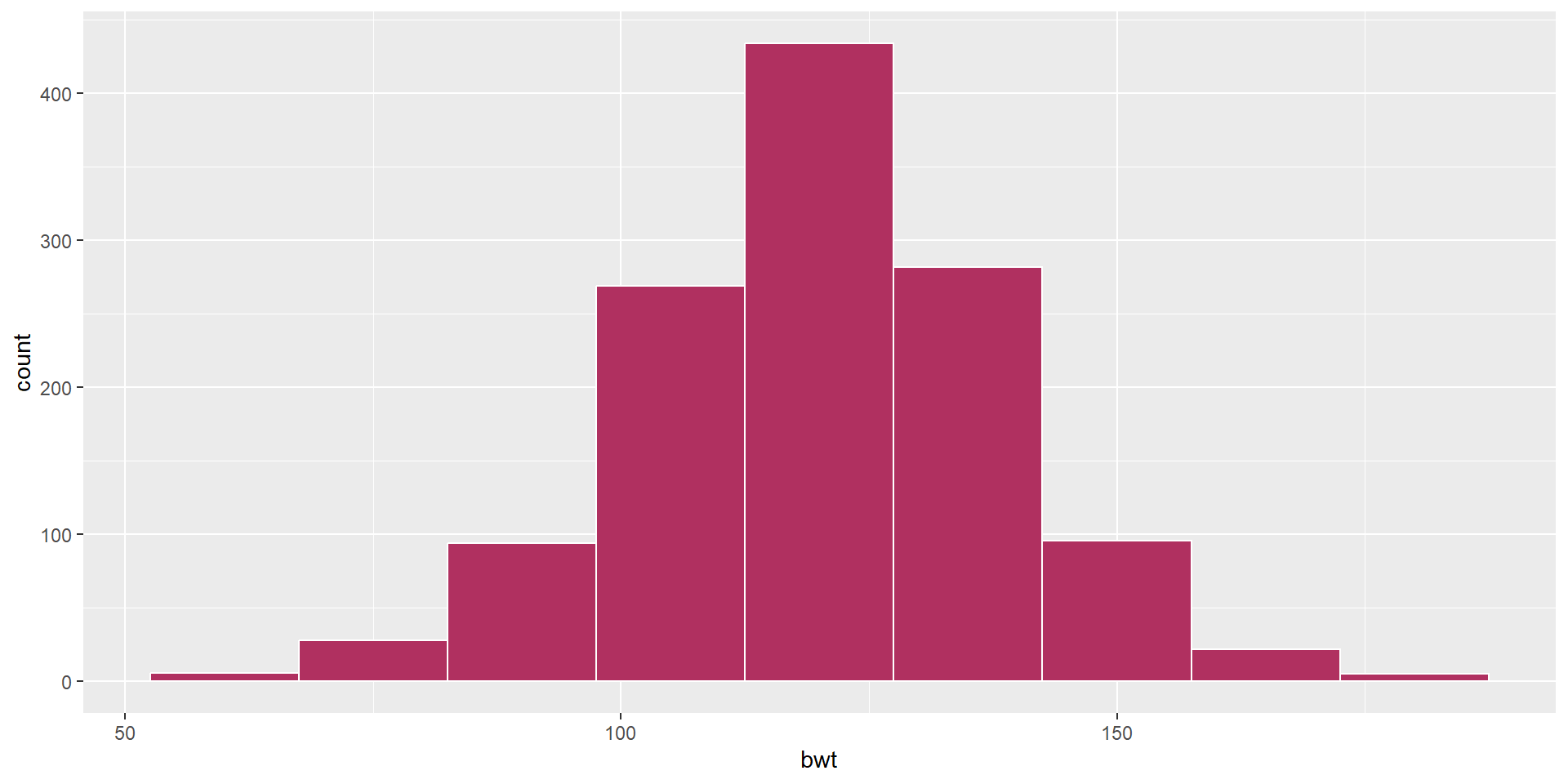
Let’s use bwt variable which is a numeric variable indicating birth weight in ounces
Histogram
Let’s use bwt variable which is a numeric variable indicating birth weight in ounces
A Colorful Histogram
Let’s use bwt variable which is a numeric variable indicating birth weight in ounces
A Colorful Histogram
Let’s use bwt variable which is a numeric variable indicating birth weight in ounces

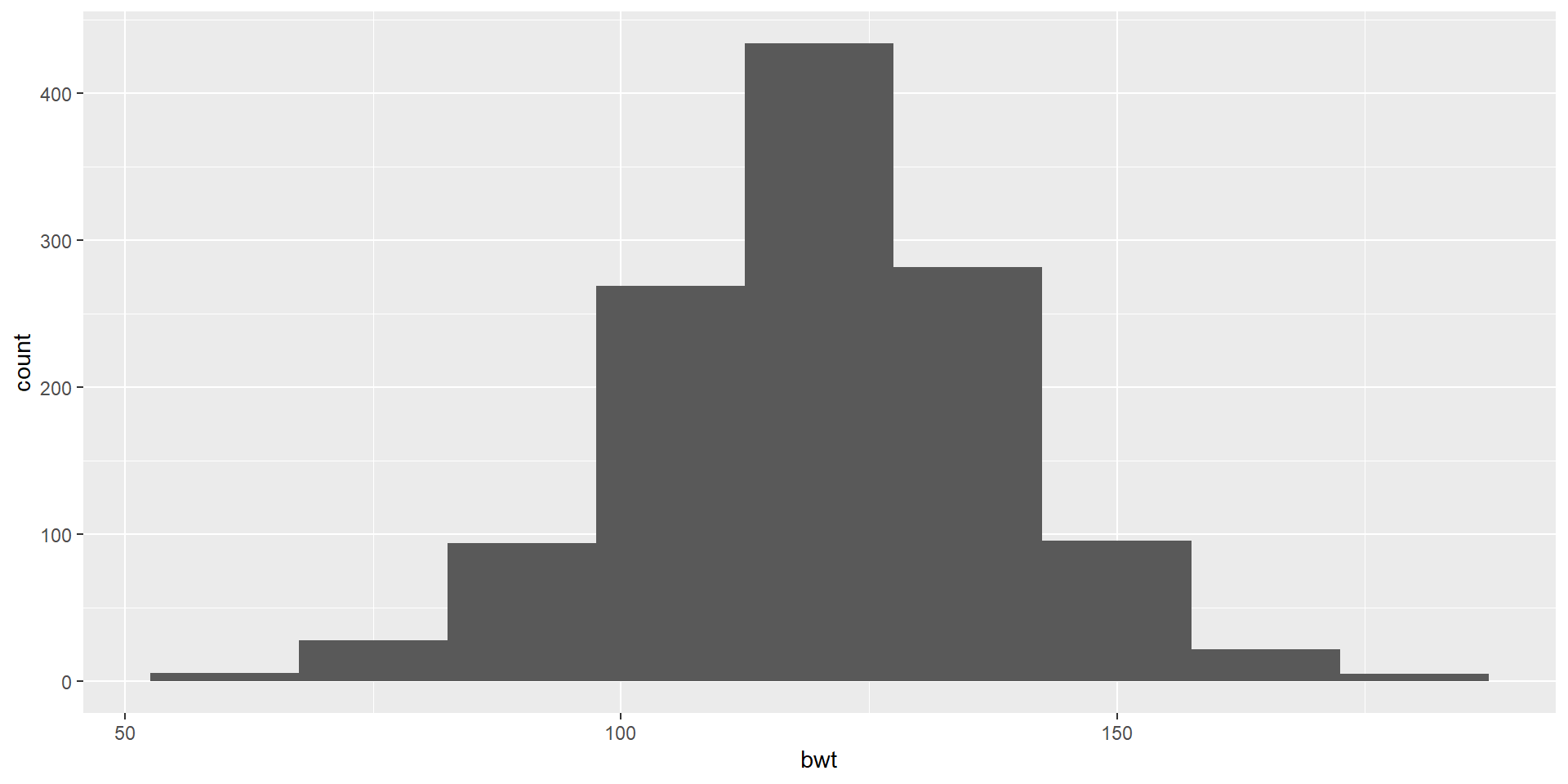
Choose your own color
- Create a ggplot using the babies data frame.
- Map the
bwtto the x-axis. - Add a layer of a histogram.
- Change the binwidth to 15.
- Color the borders of the bars (bins?) as white.
- Fill it with a color code named maroon
Visualizing One Categorical and One Numeric Variable
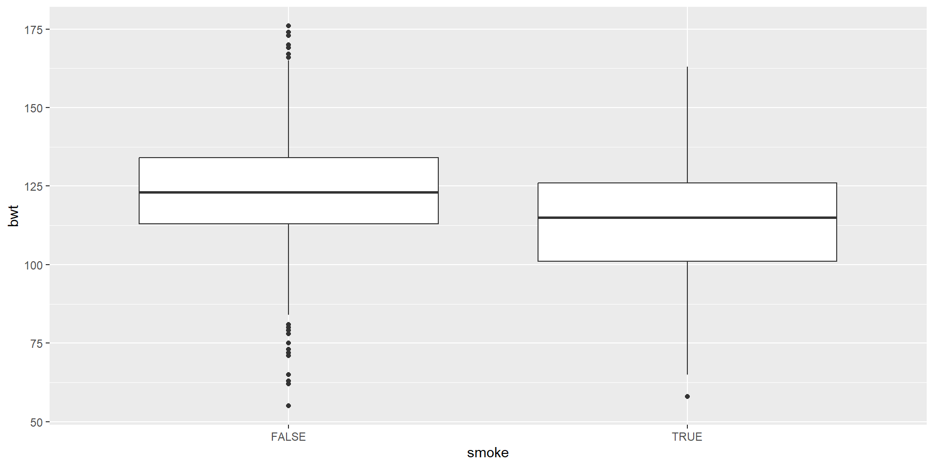
Boxplot
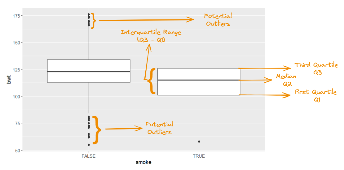
We are visualizing a single numerical and single categorical variable by using geom_boxplot
Anatomy of A Boxplot
Visualizing Two Numerical Variables
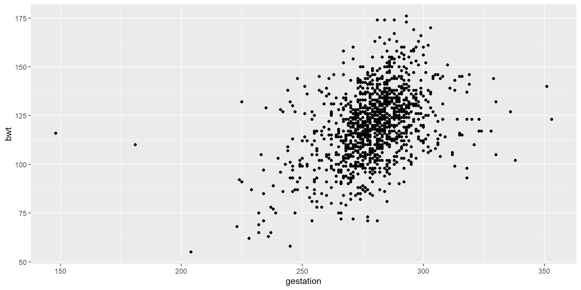
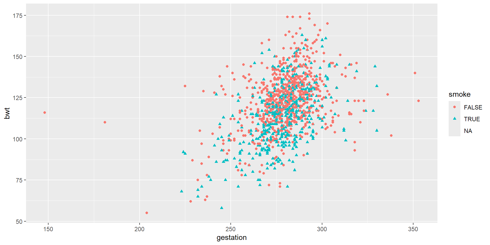
Scatterplot
Visualizing More Than Two Variables
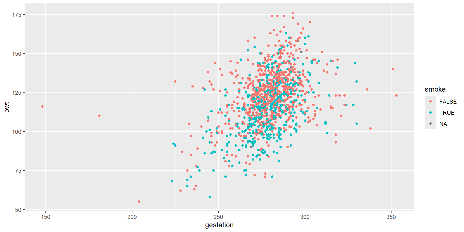
Let’s Try This
We colored continuous variables by smoke
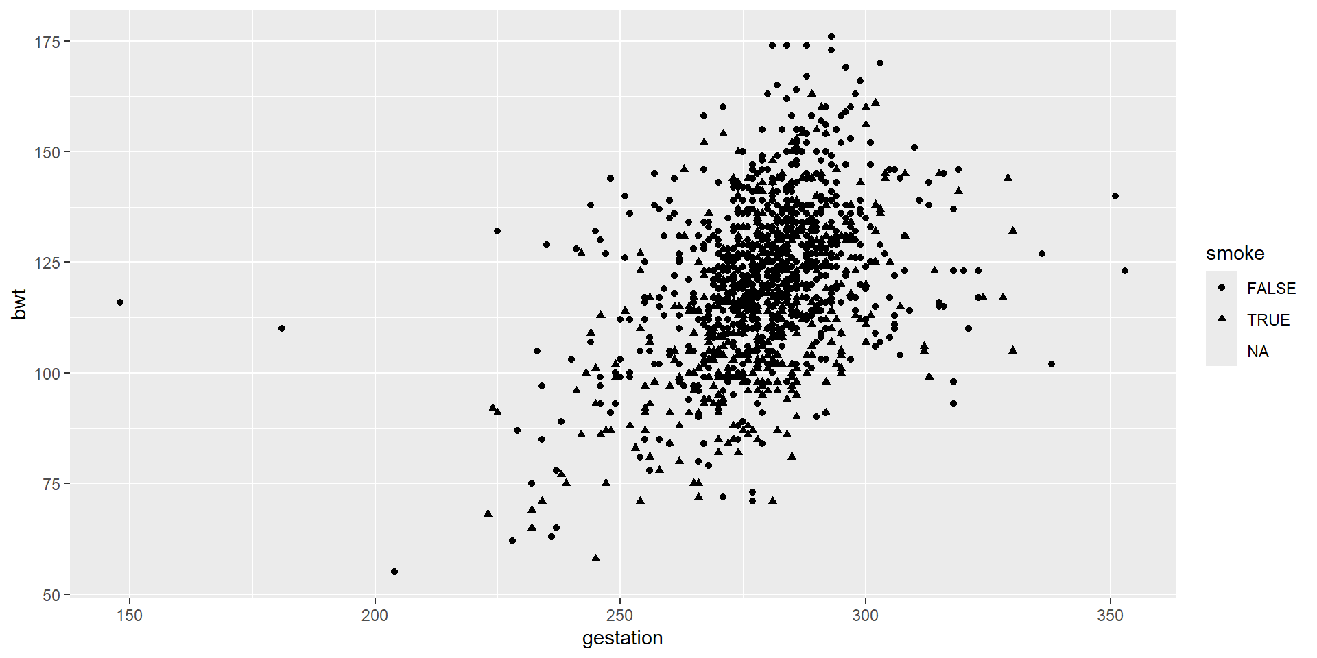
And Then…
We put different shapes for continuous variables by smoke.
And Then…
Now, we apply both different shapes and different colors.
More on ggplot
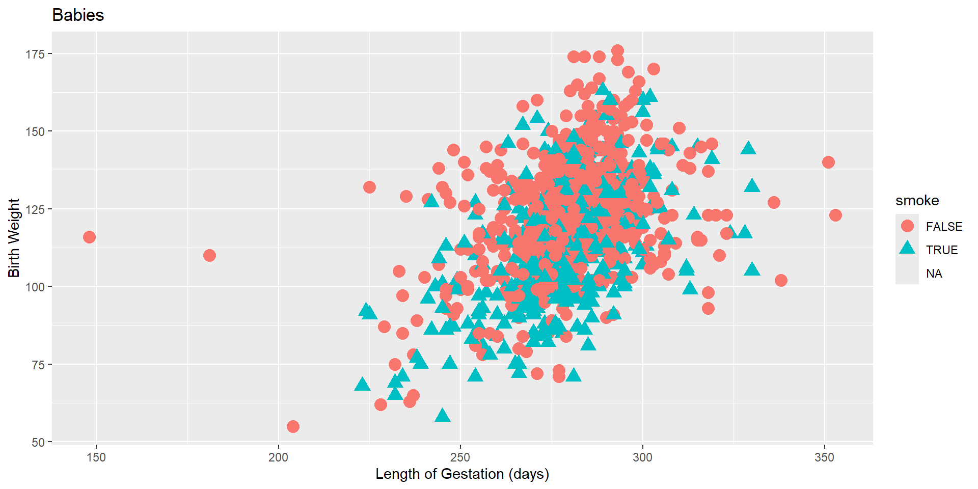
Let’s use labs() function to increase its readability.
And then…
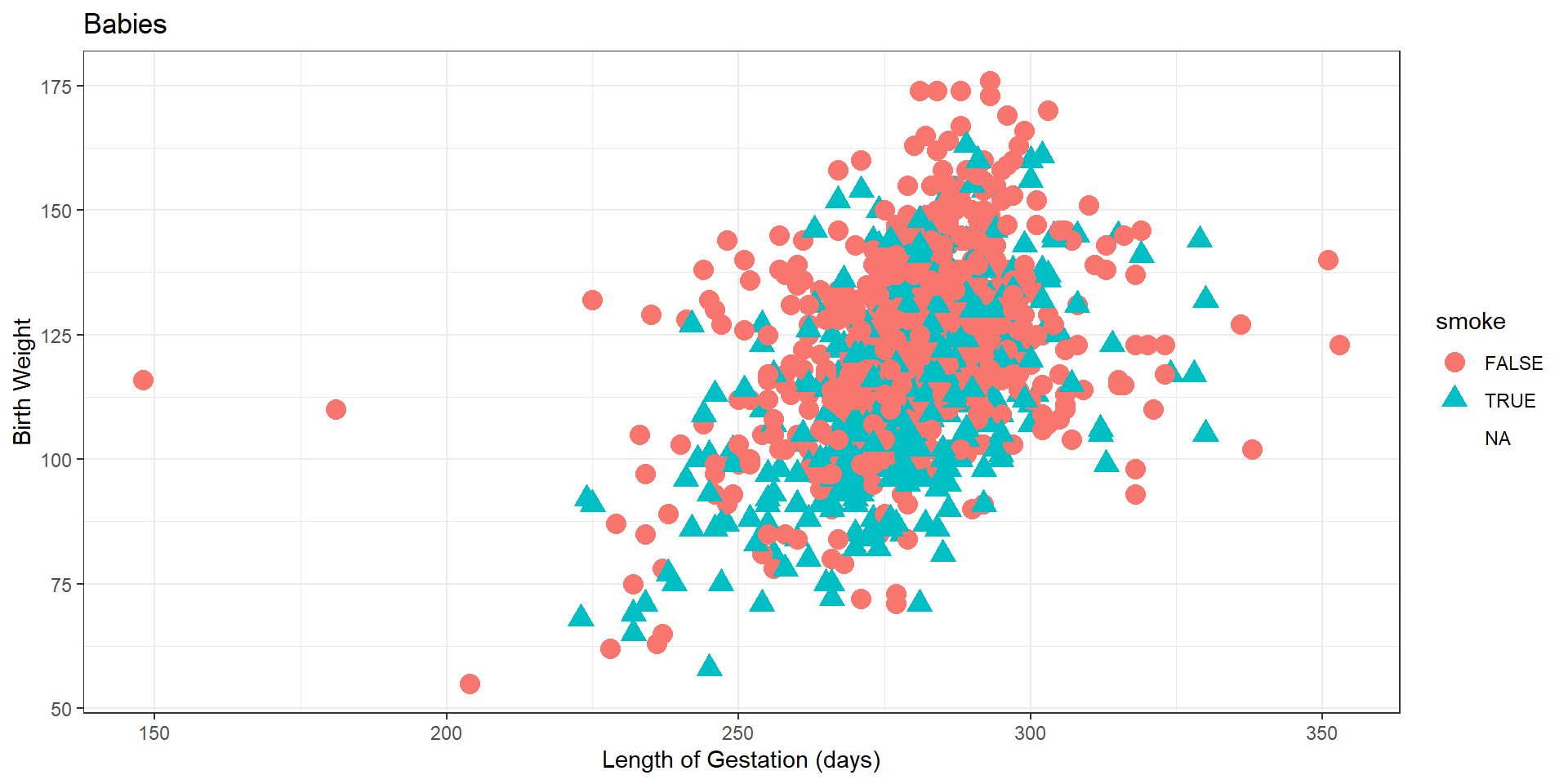
We added another layer called theme_bw(). This function is about the background, the size of the text etc.
And then…
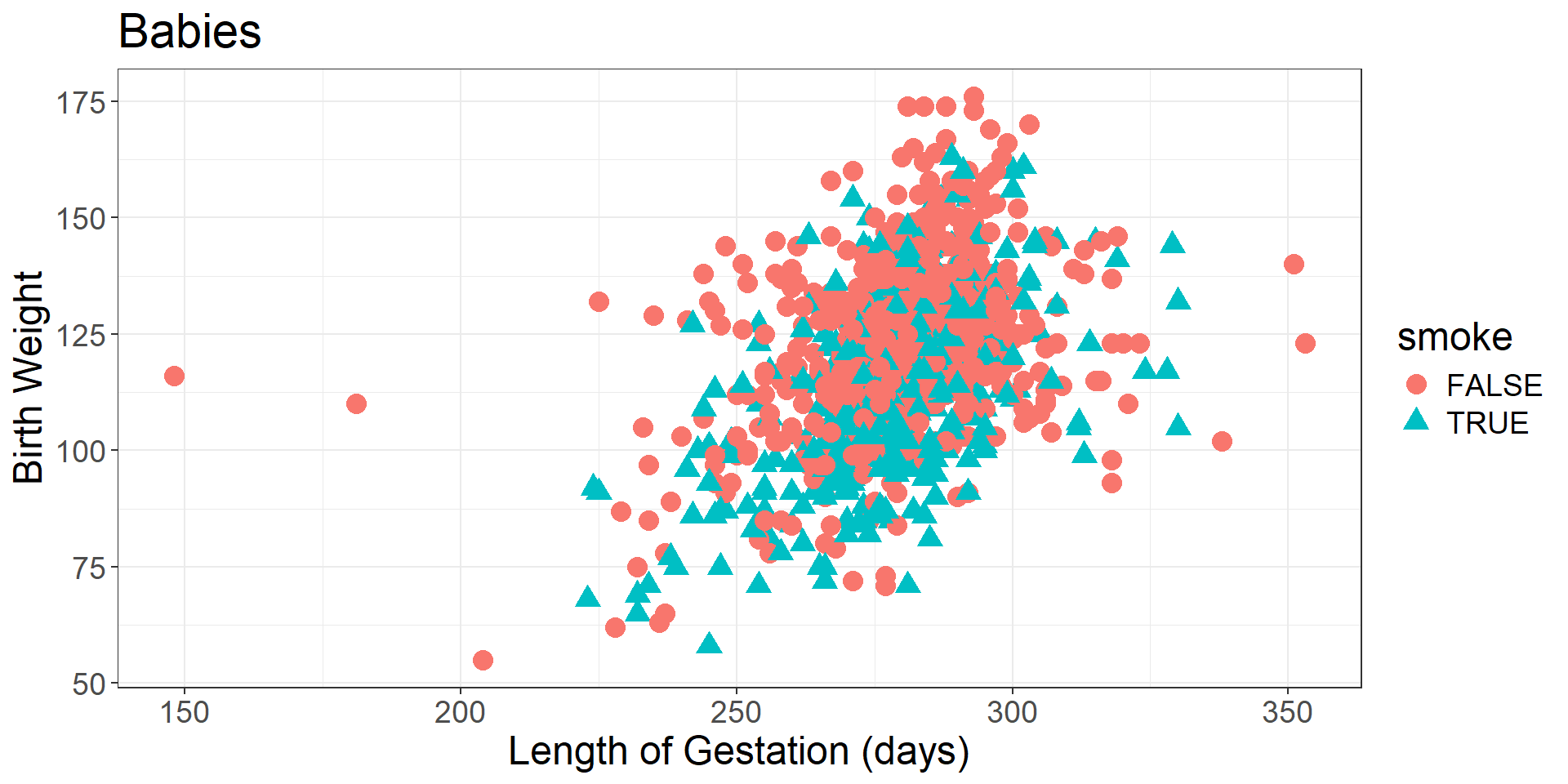
Now, we elaborated this function a little bit more and omit the NA values.
How to Complete Lab Assignment 2
Lab Assignment 2 is in Canvas (Module 3 - Lab 2- Submissions)
Just go back and follow this slide show to find necessary codes. Please copy-paste it instead of coding from scratch.
- You will be mainly changing the name of the data set and variables.
Call me over if you have any questions.

